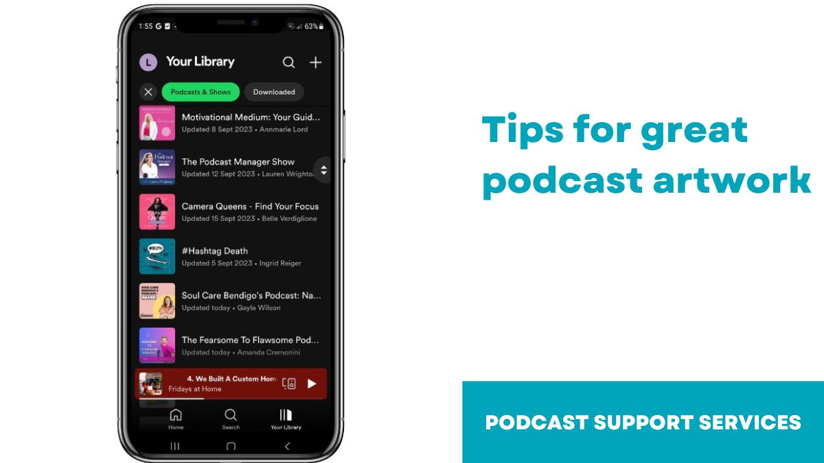
What is podcast artwork?
Your podcast artwork is like an album cover. It’s a square image that you see when people find your podcast on apps such as Spotify or iTunes.
1. Use your current branding colours
If you already have a set of branding colours and fonts then use them in your podcast artwork. It’s a good idea to stay consistent so that your brand is recognisable.
If you don’t have branding already, then it’s a good idea to think about. You could design something yourself in Canva or you could hire a graphic designer. There are many designers on Fiverr or Upwork.
2. Format of your podcast artwork
Your podcast artwork should be between 1400 x 1400 pix and 3000 x 3000 pix. It should be 500 kb or less. If your artwork is not within this size limit, it will be rejected by Apple.
3. Keep your branding consistent
Once you’ve decided on the branding of your artwork, it’s a good idea to keep it consistent with your social media and website. If you have a website and social media account for your podcast, use the same colours, fonts, and graphics everywhere. This will keep your brand consistent and your audience can recognise your podcast wherever they go.
4. Don’t cram too much into your artwork
Most people listen to podcasts on their phone. When you look at podcast artwork on your phone it’s no more than 2cm x 2cm so don’t cram too much in your artwork.
The most important thing in your artwork is the name of your show, so this should be big and bold. You can put your name on the artwork, but it’s not completely necessary because your name will come up under the “author” section of the podcast platform anyway.
Because space is limited, I don’t recommend that you use the word “podcast” as it’s obvious it’s a podcast, that’s just a waste of space.
5. Check out the competition
If you’re unsure what design to choose, go in iTunes or Spotify and look at other podcasts in the category you want to be listed in. What do you like? What don’t you like?
Do you like the artwork with a photo of the host, or do you prefer just the bold titles?
What colours do your competitors use? If your competitor’s colours are mostly green, can you stand out by having yellow artwork?
6. Stay on brand
Your podcast is another form of marketing, just like your social media pages and your website. And, in just the same way, it’s important that you stay on brand so that you’re recognisable and consistent.
As much as it’s important to get your podcast artwork right, you can change it at any time which just a few clicks, so don’t stress! It doesn’t have to be forever!

